Ciclo
Brand identity for a Braga-based sustainable packaging startup — a system built to prove that eco doesn’t mean generic.
/ OVERVIEW
A brand identity for a sustainable packaging startup — built to look like a serious company, not a farmer's market stall.
The challenge
Ciclo had a genuinely innovative product — packaging grown from agricultural waste — wrapped in branding that screamed cheap eco-startup. Leaf icons, muddy browns, a recycling symbol lifted from clip-art. It undersold the science.
The rebrand had to read as a serious materials company that could sit in a boardroom next to legacy packaging giants, while still signalling its sustainable core — without a single tired green cliché.
The approach
Mark
A precise geometric loop that reads two ways at once — a closed cycle and a cross-section of the material itself. Confident, ownable, nothing literal.
System
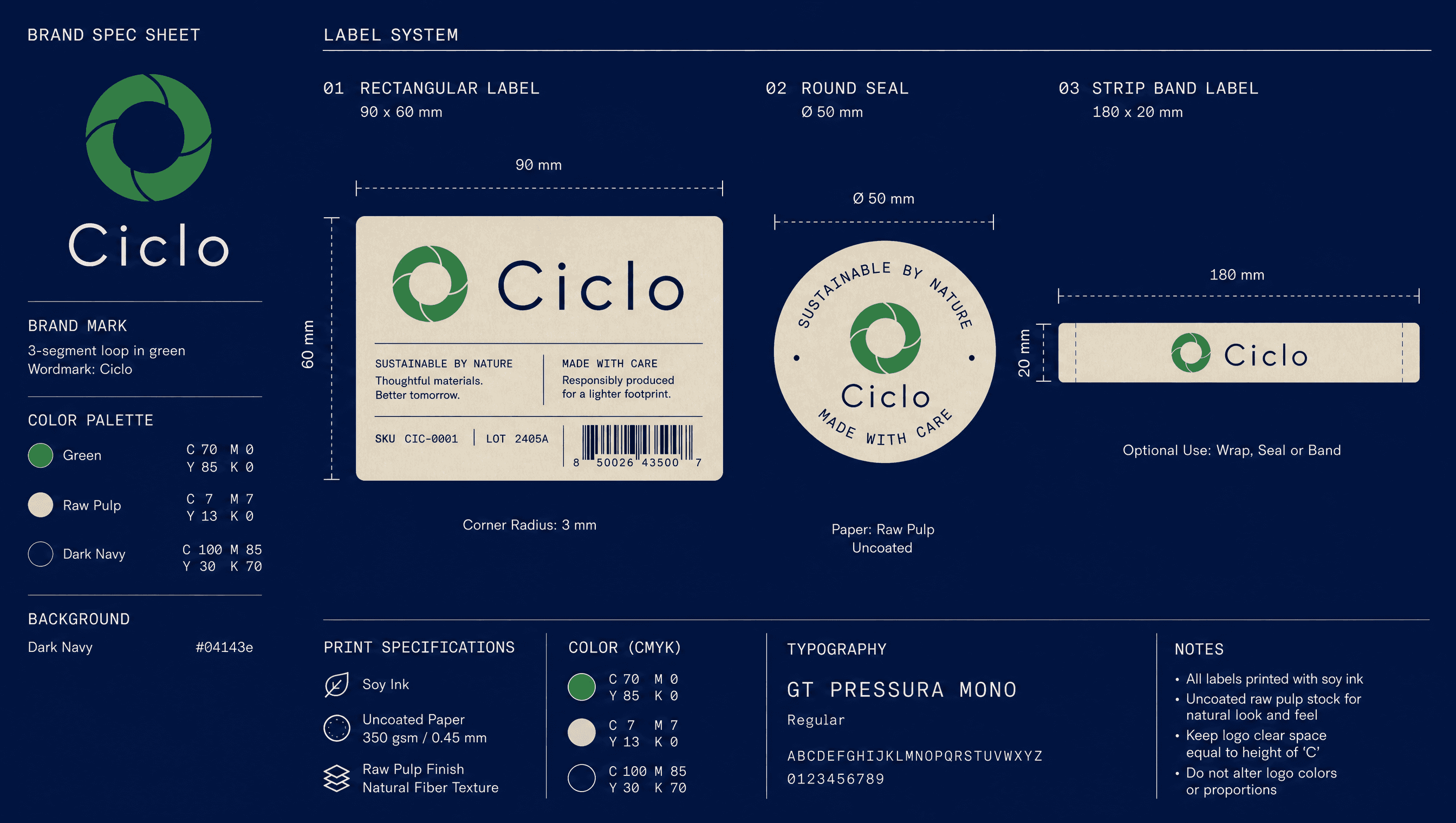
One deep green anchors a range of warm material neutrals. A rigid grid and a single typeface keep everything disciplined — the opposite of the scattered old look.
Application
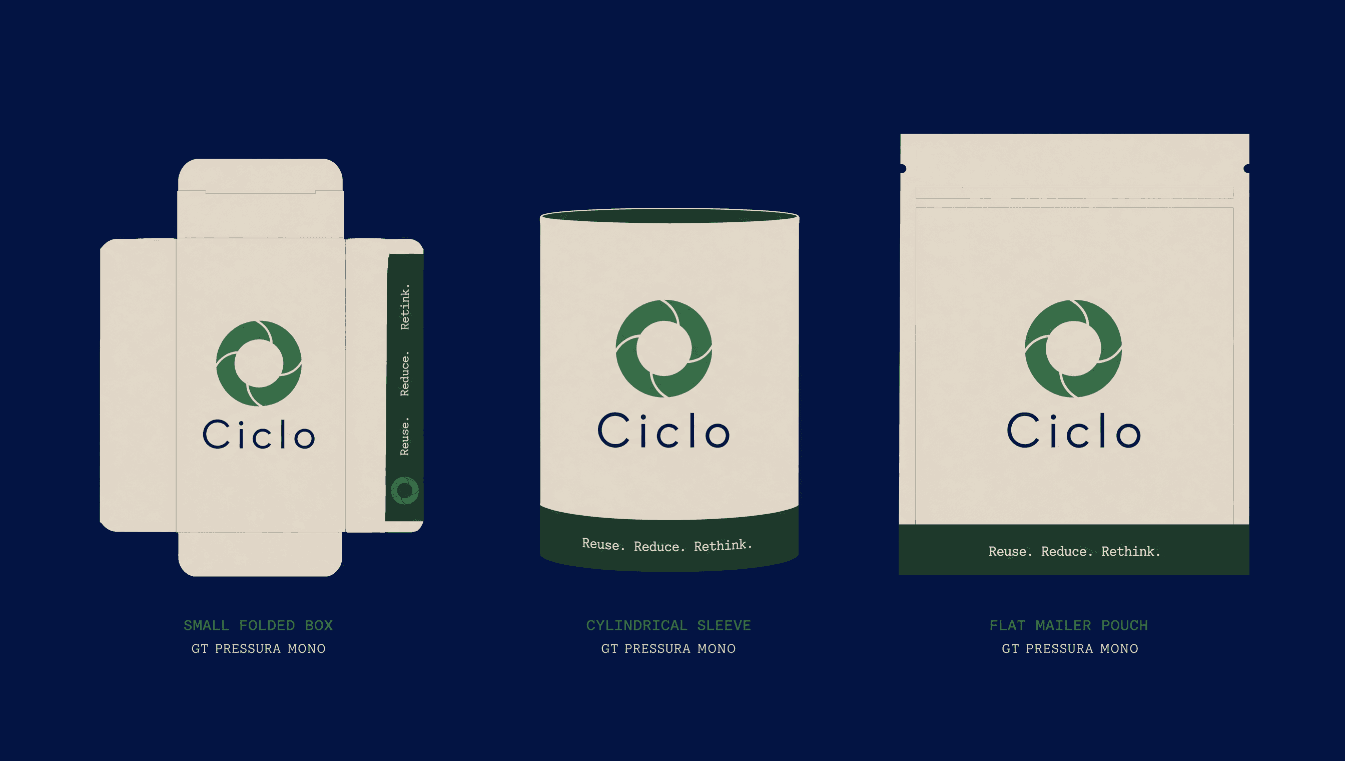
The identity is shown on the actual product: embossed on raw packaging, printed with soy inks, photographed honestly. The material does the talking.
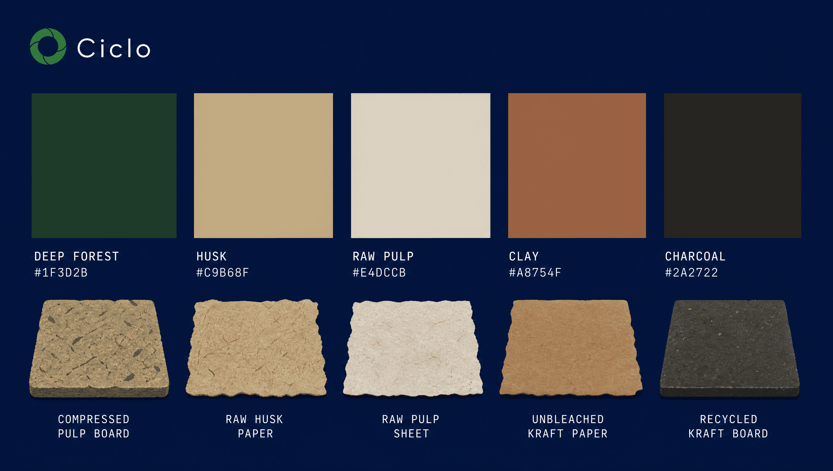
Colour palette
Typography
Deliverables
- 01Geometric loop mark + variations
- 02Colour & material system
- 03Packaging templates (3 formats)
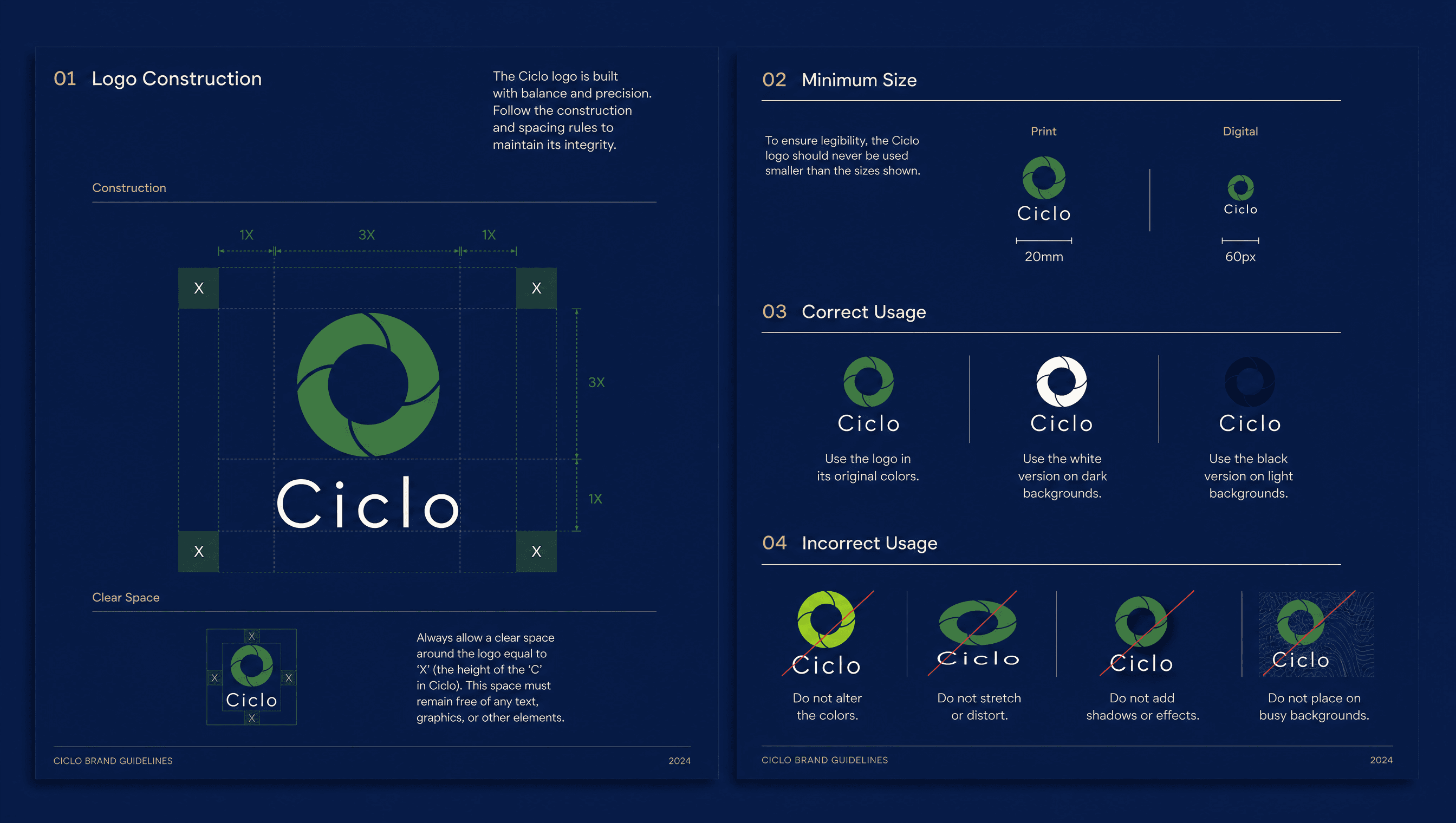
- 04Brand guidelines document
- 05Spec sheet & label system