Bruma
Complete brand identity for a fine dining restaurant on the Minho coast — mark, type system, menus and all printed collateral.
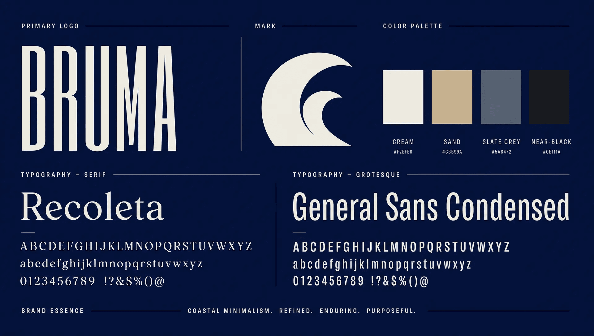
/ OVERVIEW
A brand identity for a Minho-coast fine dining restaurant — old and new at once, rooted in stone, slate and salted air.
The challenge
Bruma sits in a converted stone warehouse on a working harbour. The owners wanted an identity that honoured the building's age and the rawness of the Atlantic, without tipping into rustic cliché — no rope fonts, no anchors, no weathered wood textures.
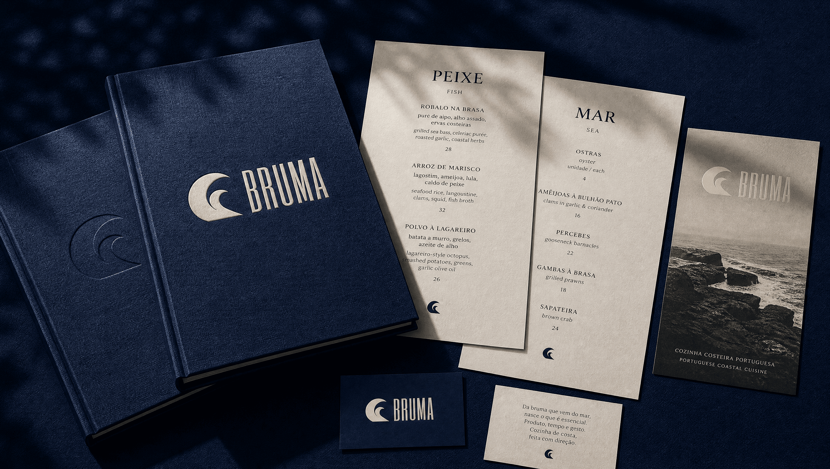
Everything also had to work in print first. Menus change daily, so the system needed templates the staff could update themselves, plus a fixed set of premium pieces — covers, stamps, signage — that would never change.
The approach
Concept
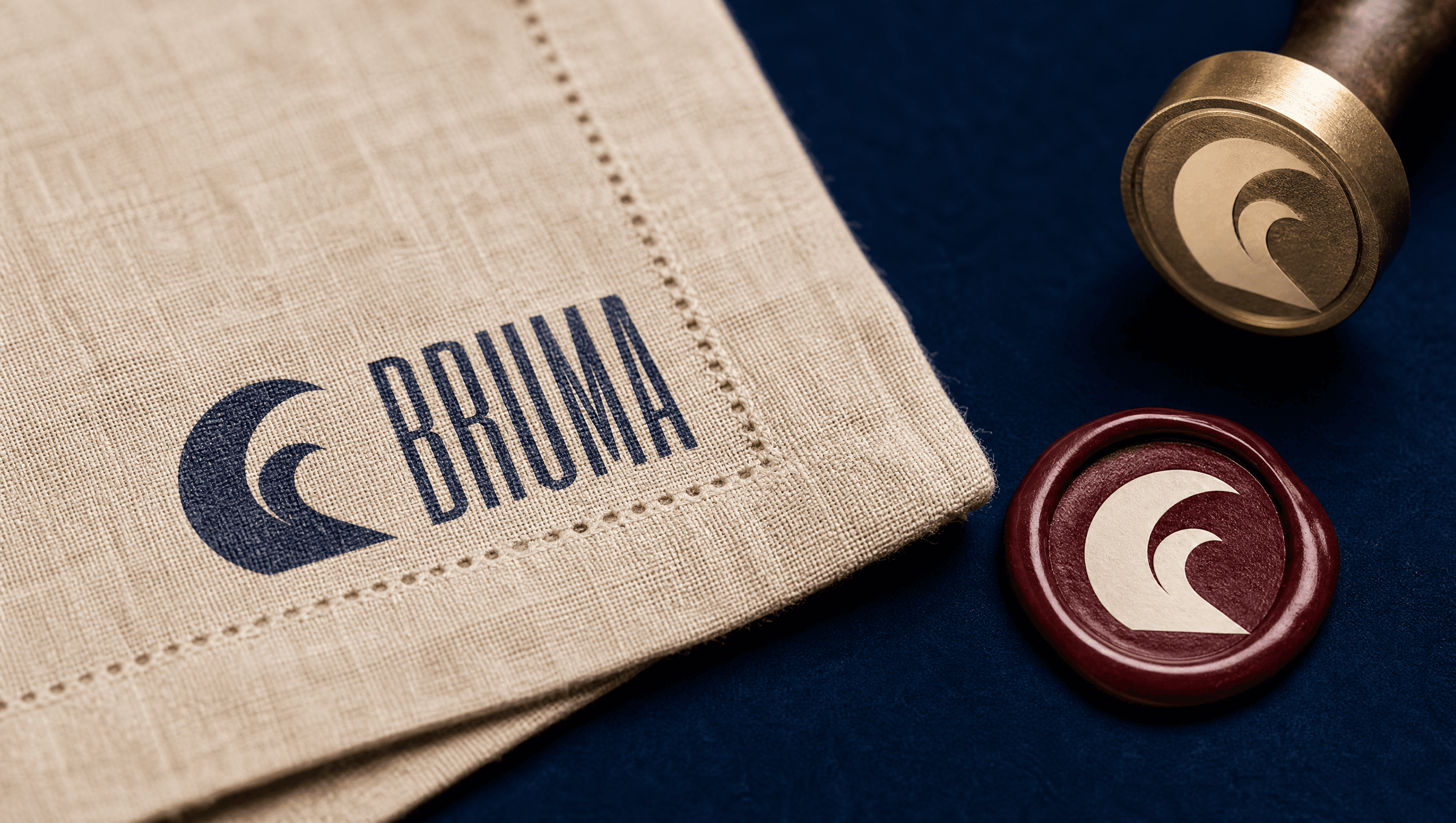
The mark is built on the idea of haze (bruma) lifting off water — a custom condensed wordmark paired with a fine tidal line motif that can stretch across a menu spread or shrink to a napkin stamp.
Material
Uncoated, heavy stock with deep emboss for the fixed pieces; light, replaceable inserts for daily menus. The contrast between permanent and disposable became part of the brand language.
System
One typeface family, one tidal motif, a tight palette. Every template was delivered with guidelines so the restaurant can produce on-brand material without a designer.
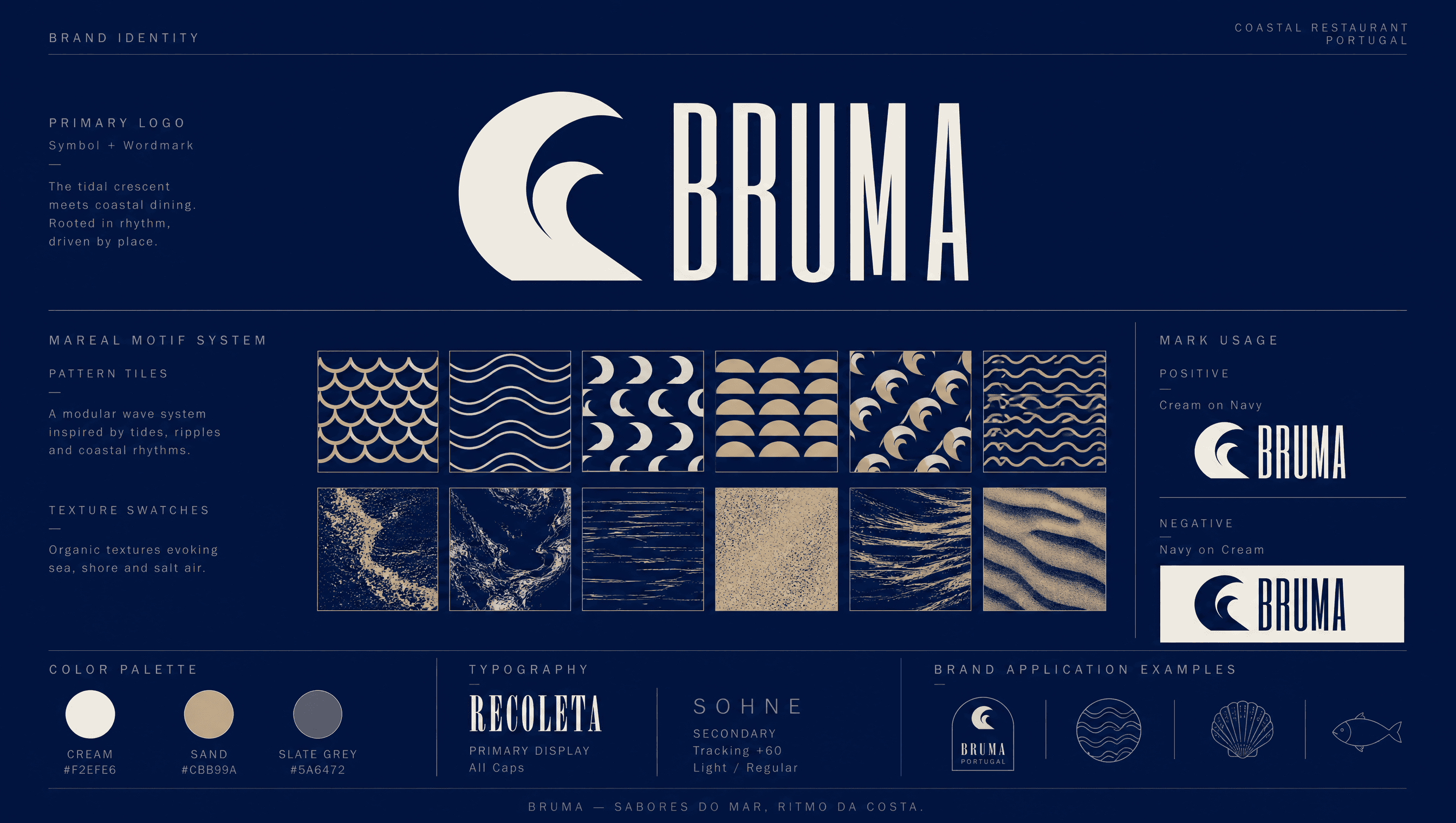
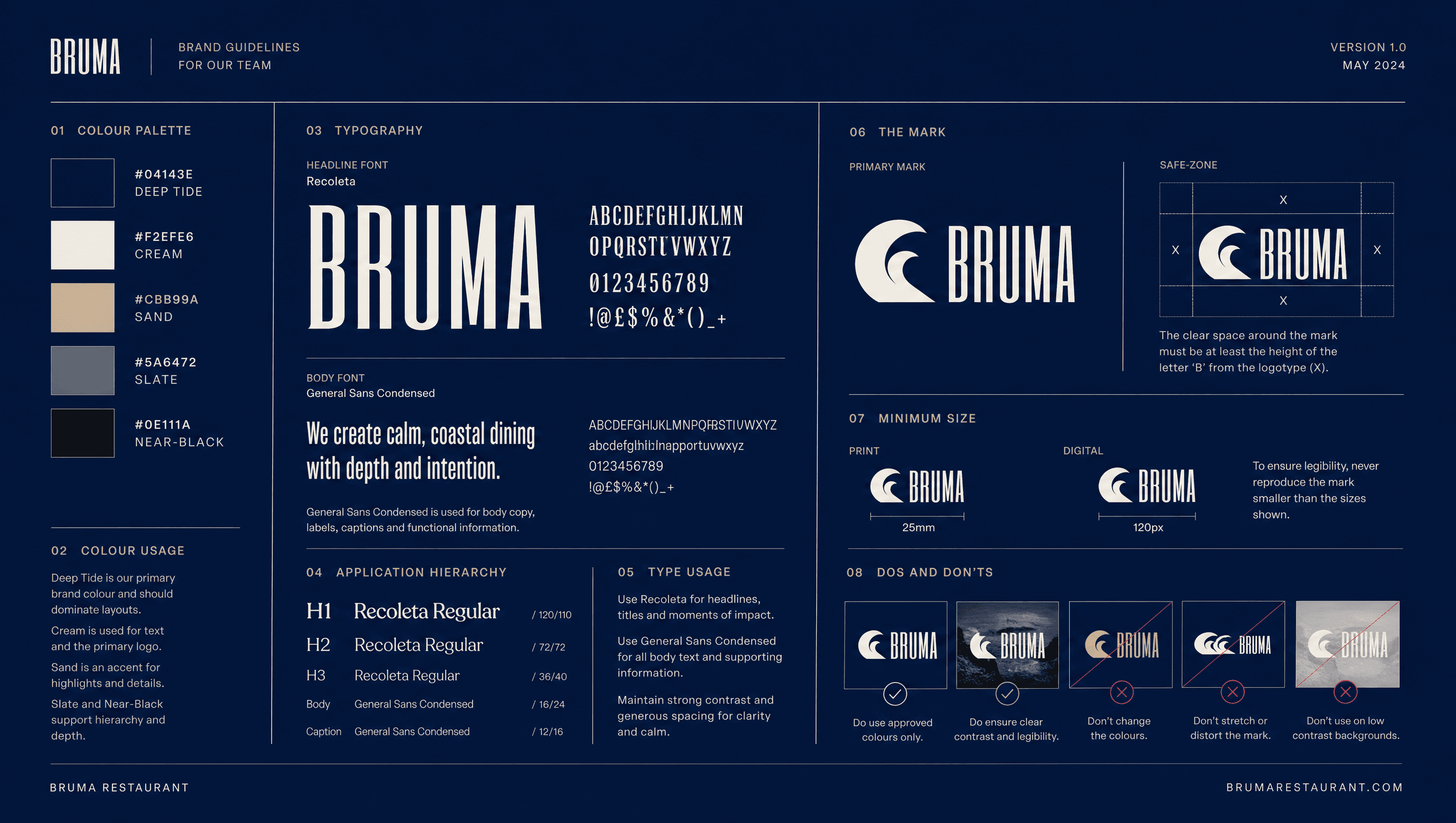
Colour palette
Typography
Deliverables
- 01Primary mark + tidal motif system
- 02Embossed menu covers & inserts
- 03Linen napkin & wax stamps
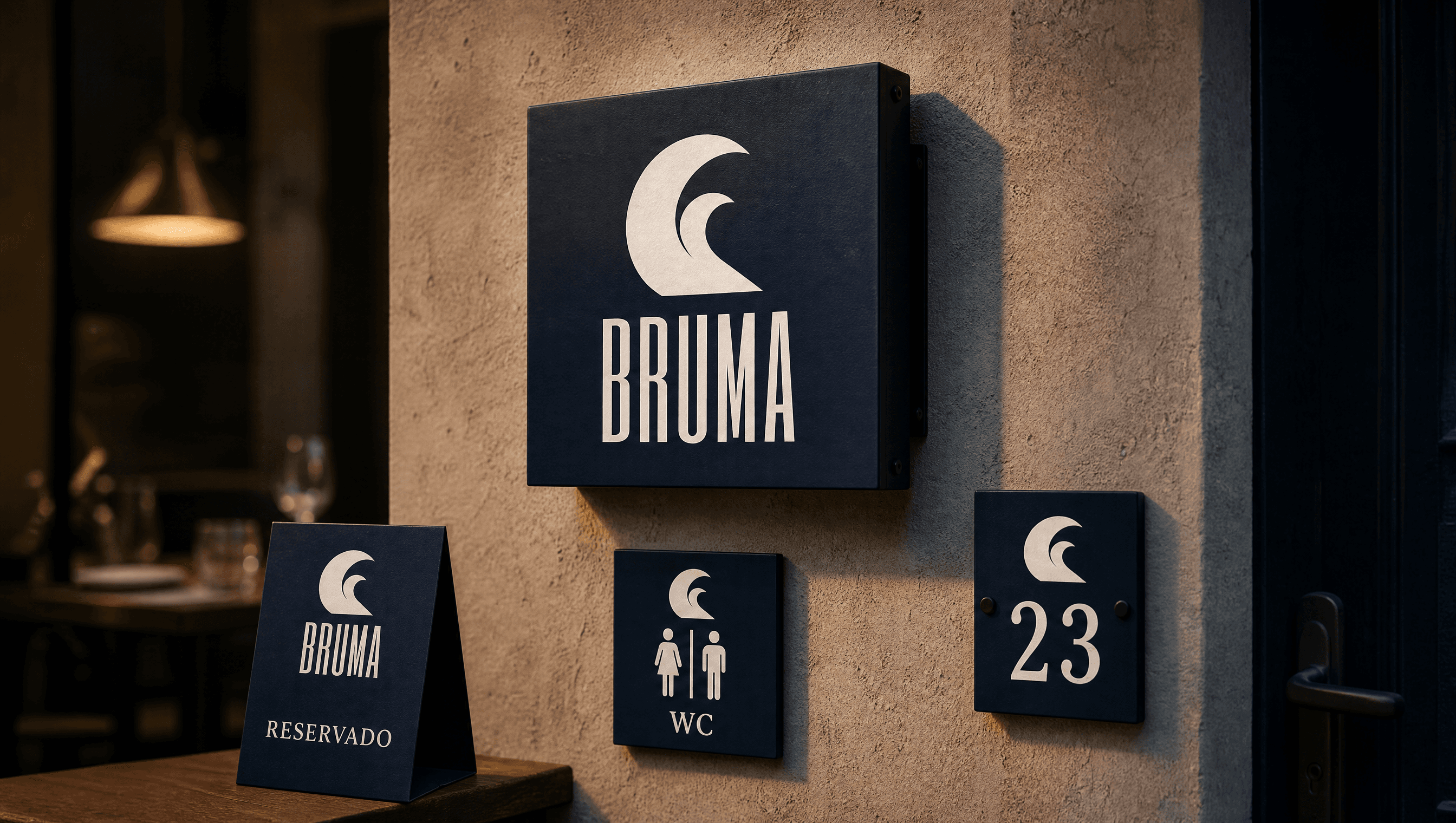
- 04Interior & exterior signage
- 05Print guidelines for staff